Image Retouch and Manipulation – Designer Research

Today I have been doing some research on designers that I could base my work around for Image Retouch and Manipulation. I started off by searching for Famous Graphic Designers and below are a couple of people who’s work I liked.

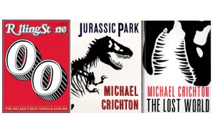
Chip Kidd

ck


I really like Chip Kidd’s work as it uses really simple illustrations and typography really well. It shows the meaning and purpose really simply but effectively. This is something I hope to get across with my posters.

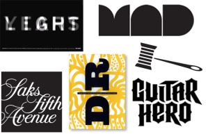
Micheal Bierut

mb2


Again I really like Micheal’s work as it is really simple and uses typography in a really simple way. As I really like simplistic work this is something I am hoping to use for the typography element to make it effective alongside the image or illustrations I will be using.

David Carson

DC


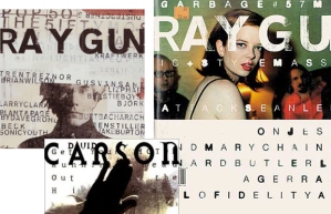
David Carson’s work really stood out to me though his use of typography. The images are very very simple, just using a photograph and lines of text within/over it. Although it is quite different I really like the effect this creates and I believe this would be a good way to get the message across.

Cipe Pineles

CP


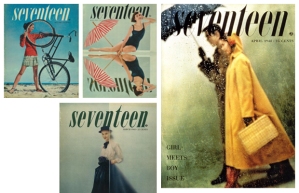
I chose Pineles work due to the very simplistic nature of it. All that us used is one image, occasionally edited, and a couple of pieces of text. Although this is really really simple you understand what they are trying to get across and I believe something this simple can take just as much work to get right as something that has many different elements to it.
Design Practice – Logo Ideas

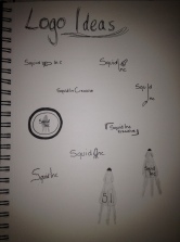
For monday we have to have a couple of logo ideas ready to be shown to the rest of the group. To do this we all decided to draw out a page of rough logo designs in our sketchbooks so that we can then have a look at all of them and then decide which one we prefer to create it into a virtual logo. Below is my rough page, a lot of them are fairly similar but I knew I wanted something that is simple but effective.

photo

Image Retouch and Manipulation – Image Editing

During today’s lecture we worked on editing photographs within photoshop. This included using levels, curves, colour balance and other properties that can be altered for the image. The first image I practiced on I just played around with all the different elements to see how I could make certain areas stand out more and see how all the tools worked. This is my first attempt:

doubleeditedAfter this we were set he task to alter 5 images to make them similar to popular filters used, such as the ones used on instagram. For the first one we had to also set an action for this to then apply to the other 4 images and see how it altered the image and if they were close to what they should have looked like. The base I used for the images was the instagram filters, which I found on google. The image below is the one I used for reference.

instagramfiltersOnce I had this up I used it for reference for all my images. The first one I tried, which I set the action for, is the Brannan filter. The first image is the one I used to make the action, and so the one it was made for and the ones after are the ones I have just ran the action on.

instagram-brannan01 instagram-brannan02 instagram-brannan03 instagram-brannan04 instagram-brannan05

Next I used other filters for the same images. Each edit was made specifically for each image to try and fit the already existing filter. The order of these is; Hefe, Lomo-fi, Sutro and Toaster.

instagram-hefe instagram-lomofi instagram-sutro instagram-toaster

New Media – Research

For our New Media module we are looking at internet mashups and remixes, which takes the form of both images, video and audio. To start looking at this I googled popular internet memes followed by mashups. This brought up a number of links and videos that could be used. This has given me a broader understanding of the mashups available on the internet and the input they have on people and the creator. I have listed these below for future reference when either creating my own or using someone else’s and following the journey and effects it has taken.

Memes

http://www.policymic.com/articles/11844/what-is-a-meme-and-what-are-the-50-most-popular-memes-online

http://www.quickmeme.com/page/11/

http://memebase.cheezburger.com/tag/Memes

Design Practice – Website and logo research

During todays lecture we spent some time researching different websites and logos. Throughout my research I found a number of graphics and sites that I really liked. I have listed the links below for future use. Although I have split them into categories there are ones that I like both parts of!

Logos

big fish® – brand, design and marketing consultancy

http://www.theorangecircle.com/

http://www.seatableuk.com/

http://www.govicinity.com/

Websites

http://www.interactivered.com/

http://www.heredesign.co.uk/

http://www.m4design.co.uk/

home

http://www.thecollectivedesign.co.uk/

Image retouch and Manipulation – Mat Maitland research

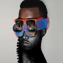
During our first Image retouch and manipulation we were introduced to designer Mat Maitland. We were asked to look at some pieces of his work, find inspiration and then create our own piece to reprisent us with his designs in mind. Below are the pieces of work that I looked at to draw inspiration from.

Kanye-Mat-Maitland M3-w600_zps706d8a9f mat-maitland-3

After looking at these I tried a couple of designs by playing around on photoshop and putting different things that I like together. In the end I decided to make a piece based on the Kanye image. To do this I got a picture of Hayley Williams, the lead singer from my favourite band, and started to play around with cutting the image up and placing it. Once I had got it all where I wanted it I then started to play with the colours and adding different items into the main image to make it more interesting. The last thing I added was a small quote, to break up the space on the left hand side. Below is my current finished image. This is completely different to anything else I have ever made or anything I would attempt to make, however I had fun playing around and going against anything I have ever tried to do before!

mmdesign2e

Design Practice – Design Agency Group

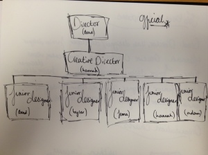
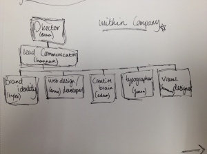
This year for Design Practice we had to get into groups of 3-5 to create a design agency. We were asked to reprisent a number of skills and techniques so that we can cover most things that a client can ask us to do. After the first lecture we chose who we wanted to be with for our agency. Ours is made of 5 people with a range of skills from web design, illustration and design for print. This week we met up outside of uni to discuss the agency and start getting ideas together. Below is the first specification for the group which includes all of the basics.


Name: Squid-Inc
Type: to be decided
Members: Bradly Locking, Hannah Lindsay, Jenna Godbolt, Tyler Ayers, Adam Fidgett
Roles:

  • Brad – Web Design/Developer, Director
  • Hannah – Lead Communicator, Visual Designer
  • Tyler – Illustrator, Brand Identity
  • Adam – Creative Brain, Videographer
  • Jenna – Typographer, Layout

Lead Contact: Bradly Locking – bradly.locking@me.com
Philosophy: ‘You give us the idea, we write the story.’
As a team of designers we love new ideas. We enjoy taking a conecpt and turning it into reality. With our range of skills we both work together and seperately to give the client the best outcome, and something they can be proud of.

Design for Print Evaluation

Although I have been designing for a few years I have never created anything large specifically for print. Coming into this module I was anxious to see how the final piece would turn out and how I would tackle creating a book.

I have never made something like a book before, and so this was completely new to me. It was difficult to first think of an idea, and then try and put it all together so that it had some sort of form. I found that setting up the pages was more difficult than I thought as they are all in the wrong places to where you think they should be as they are being created to be placed together as a book.

Although this was a challenging topic for me and something completely new, I had fun creating the illustrations and seeing how I could put them together. I know this is not my best piece of work, however I look forward to taking the skills I have learnt through this topic and using them in the future. Design for print is very important and I know it is something I need to know and so I am happy I now have some basic skills.

Finished Perfume Book

This is the finished book for the Design for Print module. The book is based around a family of perfumes, all of which have similar styles in the bottles. This is the lids as they are all flower shapes showing they are part of a family.

All of the illustrations were made in Adobe Illustrator and then placed into the InDesign document. Although the pages are wrong within the PDF this is how it would have been laid out to be printed and put together as a book.

Lindsay_Hannah_Book